We’re seeing masks everywhere at the moment with the global pandemic, but rest assured, this blog post is not about covid-19; it’s about report design using a very different type of mask to the ones we’re now accustomed to seeing.
In data storytelling, it’s often a good idea to add deeper analytical views and/or context. So, along with drill-throughs, a trick I use on a regular basis is hidden visuals and shapes that can be activated by using buttons and bookmarks.
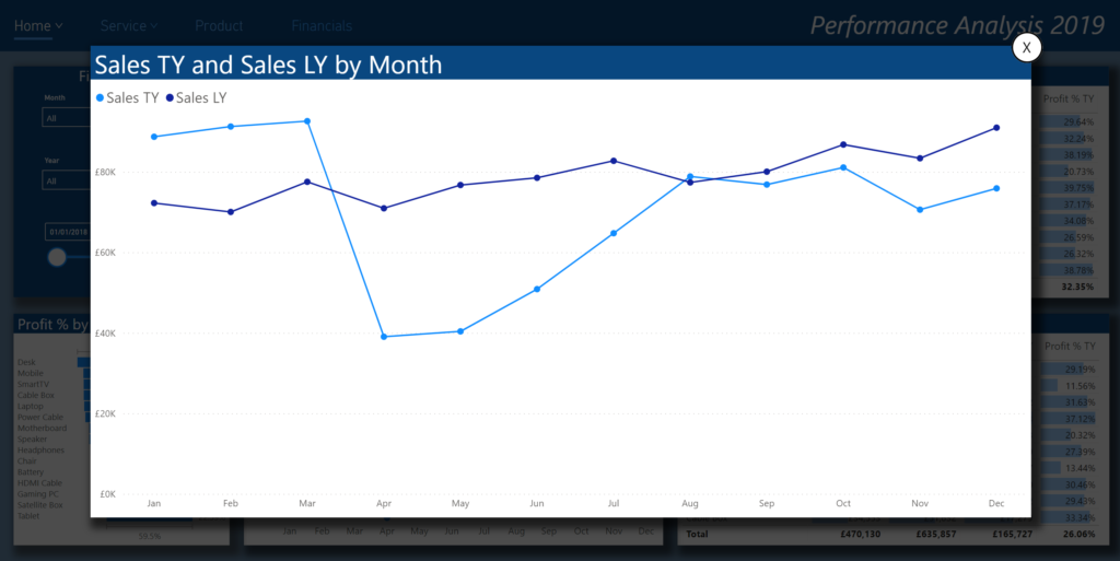
For example, let’s imagine that you have a headlines page showing executive level/high level data and visuals. This is great for quick-glance viewing to see what happened in your business, but what if you were interested in the ‘why’?
Maybe a decomposition tree could be a good way of showing this deeper analysis or root cause, but how could we view it on this page?
Well, one way to do this is to add a semi-transparent mask to cover the underlying visuals and then place your decomp tree on top of that. Your focus can now be purely on the deeper analytics of the high level aggregated data.
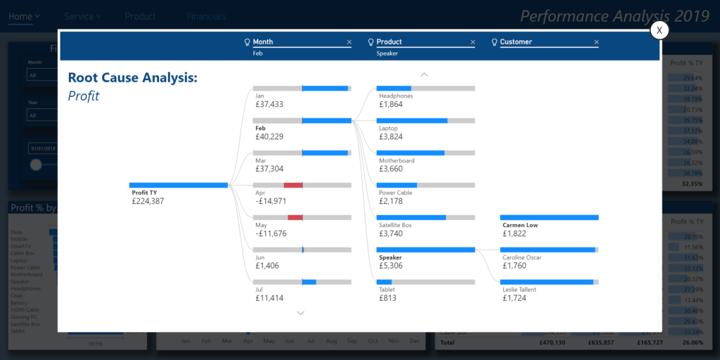
I’m not going to describe how to add bookmarks and buttons as this was covered in a previous blog post called ‘Web Style Navigation‘, but in order to achieve the effect of the mask, just simply add a rectangle shape with a black fill that has a 30% transparency applied.
*Note, it’s important to layer all of your visuals in the correct order; you should use the Selection pane for this. It’s also best practice to use a good naming convention for your report objects and bookmarks as well as grouping for effective management.
WHAT ELSE CAN WE DO WITH MASKS?
I’ve never really been a fan of the default visual header elements that the Power BI team have on offer for their visuals, therefore I often create my own, such as a replacement for the focus mode activator.
The main reason that I don’t like them is outlined on my previous blog post ‘Stop Distracting Me‘. In here, I talk about how and why they should be used sparingly, if at all, and in this post I explain what you can build as an alternative.
Ambiguity is our enemy when report designing, and hiding applied filters, or hiding objects that will only appear when you move the mouse around is one way of losing your audience. How are they to know about things if they aren’t visible from the outset? Don’t get me wrong, I’m all for data exploration and for people to discover insights themselves, but sometimes we need to point people in the right direction by doing things right in our UI/UX design.
So, to do this neat trick, simply add an image that you wish to use as your expand activator and then add an action to go to the bookmark that you’ve created to show the expanded visual and mask which is layered behind it.
I applied an extra step of adding a blank button that has a white fill with 50% transparency as the default state, and a 100% transparency on hover on top of the black image. This gives the ‘call to action’ effect when you roll your mouse over it, as it gives the impression of a discreet grey colour in default, but then becomes more prominent when hovering over it. Not so much as to distract, but rather, it gives users the indication that it’s a call to action that can be clicked. In this instance, the bookmark action should be applied to the button rather than the image underneath.
Of course, from a performance perspective, it goes without saying that we need to proceed with caution when adding lots of visuals, images or shapes, as they can have a major impact on rendering times and overall performance of your reports.
Great post – I will definitely look to utilize this technique in some of my reports. I was going to mention the downside of performance when adding lots of visuals but you mentioned it in the last paragraph. Thanks!
Thanks for your comment, and yes, performance is paramount otherwise users will lose interest straight away, and rightly so.