INTRODUCTION
This blog post describes the importance of where we should be focussing our attention when it comes to making business decisions based on average metrics such as sales revenue, employee salary, or even house prices.
Not a typical Power BI blog post but extremely important to know the difference between mean and median if you work in analytics, or if you wish to present data using Power BI as your analytical tool of choice.
WHAT'S THE DIFFERENCE?
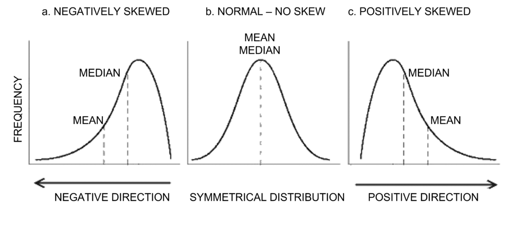
To calculate the MEAN of a metric, we take the sum of all values and then divide that total by the number of observations.
To calculate the MEDIAN, we must first sort the values in ascending order and then seek the middle value of those observations (so 50% of the values will be below, and 50% will be above).
WHY DOES IT MATTER?
Outliers can skew things massively! Fact.
Let’s imagine that we want to know the average revenue generated by our sales team, for all of our products that were sold last year.
Now, if all of the products were of equal or similar value, then we probably wouldn’t have a problem, and could therefore reliably use the mean as our average revenue.
However, if we had a scenario where one of the products was of particular high value, then the mean figure would be skewed and would possibly yield a very misleading average benchmark. This is because the calculated average will be higher than the central tendency due to this outlier. For this reason, you should use the median instead, as this would never be affected by outliers, whether high or low value.
Both standard deviation and interquartile range also play a huge part here.
This is the actual spread, or distribution of the data points, in this instance, product revenue.
So, if the standard deviation is a particularly large figure then this will be because of outliers and values which are much further away from the average figure. Ideally we are looking for low figures. Unfortunately there is no maximal standard deviation benchmark but lower numbers are usually better.
The interquartile range (IQR) is calculated by finding the median of the group of values below the median of the full data sample, then find the median of the upper range, then calculate the difference between these 2 medians.
You’ll discover again that the IQR is often a more suitable measure when looking at your revenue distribution here, because of the way that large outliers do not affect the IQR like standard deviation can.