Ok, so you’ve spent all afternoon creating your new report page, aligning the visuals correctly, following Gestalt principles, making sure that the font sizes are a reasonable size, and your encoding of the data in your charts is done correctly.
So, you now decide to move it from the development area and publish it to your production environment, but you leave the visual headers on. Why?!!
Leaving your visual headers switched on or unhidden, without actually serving any practical purpose, can be extremely distracting for users when they move their mouse around your report.
For whatever reason, the Power BI default visual header hasn’t seen good design methodologies applied to it. It simply pops up when you move your mouse over the visual, then disappears when the mouse is moved somewhere else on the report page.
We want our report consumers to interact with the report and start exploring, but when they see visual headers pop up everywhere then it can be a really disengaging, and more importantly, confusing experience for them.
For better report adoption, and to give your users a more enjoyable data exploration experience, visual headers should be hidden at all times unless they are designed in such a way that they don’t distract.
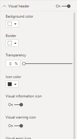
For example, did you know that they can be formatted? Colours can be added to the visual header items so that they ‘blend in’ with the visual, but all header items that aren’t required should be switched off by the report author.
In my opinion, this is still not the answer, but it’s certainly better than leaving them with their default settings.
A great tip for using something other than the default visual header is by using buttons instead, as a way of prompting a ‘call to action’.
For example, I’m not a big fan of the default Focus Mode option, so if I need to add this feature to a visual that requires enlarging, then I’d add an image with a blank button placed on top which can then trigger a bookmark to a larger version of the visual that you want to view.
I’ll be writing a full blog post on this simple, but effective trick very soon.
IN CONCLUSION
As always, when designing your reports, think about how it will be used by others, the report consumers.
Don’t always stick with the defaults, think outside the box, and question whether there is a better way of doing things. There usually is.
There should be no distractions, no ambiguity at all, and navigation and ease of use should be carefully planned and executed before releasing it to the world.
I agree with this and nothing more annoying, than the rogue header you missed when checking. Only for someone to discover on the published report.
Looking forward to the Custom focus mode.
Pingback: Put a Mask on Please