It’s regarding the “Customize visible pages in the page navigator visual” feature that now allows us to choose which pages we’d like to show or hide when creating a navigation bar.
Whilst this is a welcome addition, I feel we are still not quite there yet with the amount of control that should be given to the designer when using this visual.
Acceptable UX, and the application of good design principles, will make or break your published reporting solution, and guiding your users around various pages with little or no effort at all is key to getting this right.
CREATING THE NAVIGATION BAR
Many modern websites now have a horizontal navigation bar at the top of each page, so that anyone visiting the site can select each page with ease.
The familiarity of this type of navigation makes it an ideal choice when creating a Power BI report that has multiple pages. I do this quite often.
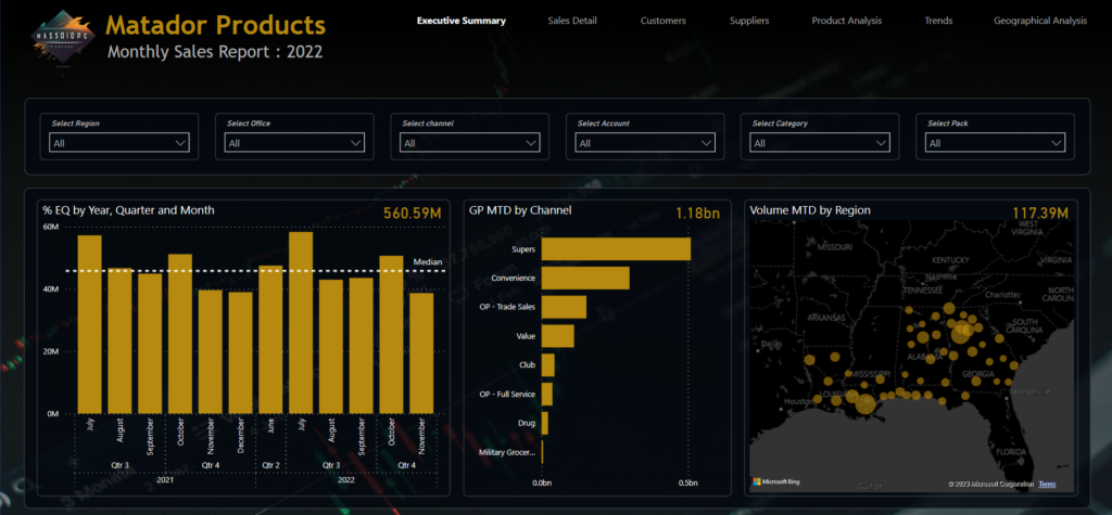
Here’s an example of the kind of navigation that I’m describing:
This clean looking navigation bar at the top right of the page is effective because the reader would know instantly that he or she is looking at the Executive Summary page, simply because it is highlighted in a white bold font, while the other page indictors are a soft grey colour, which would suggest that they are not activated, but are available for selection.
There is no background on the navigation bar, no visible borders around it, but it does the trick of providing enough information to the user of the report.
We can build this bar very quickly with the Page Navigator visual, by clicking on Insert > Buttons > Navigator > PageNavigator
The visual will then be automatically populated with your page names. In our example, we have all pages hidden, apart from the first one, and at this stage, all pages will appear in the visual.
FORMATTING THE NAVIGATION BAR
The formatting of this visual is where the problem lies.
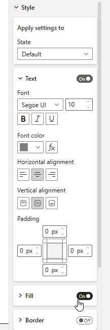
We can remove the background, fill, and borders, and change the font colour and weight depending on the button state. all good so far.
We can now also hide certain pages thanks to the February 2023 update. Great!
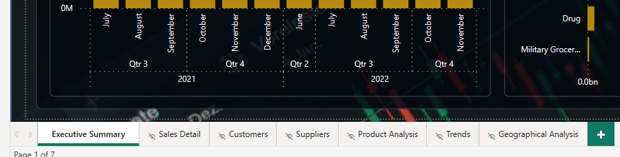
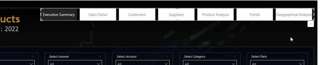
However, page names are very unlikely to have the same number of words and letters for each page; and this is exactly the reason why I am unable to implement this brilliant time saving piece of the report building within any of the horizontal-navigation-bar-type-reports that I publish to a production environment.
HITTING THE BRICK WALL
“What have page name lengths got to do with this?”, you might ask.
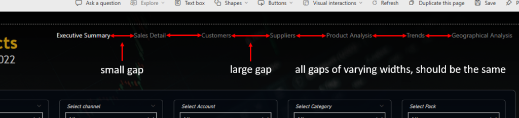
Well, when we use the page navigator visual, Power BI assigns a uniform width across all page buttons when it is used for horizontal navigation.
This would mean, that after all the formatting has taken place to remove the background and borders, you will have uneven gaps between each word due to the underlying width of each button.
At the time of writing, these cannot be individually adjusted to “fit” the page name width.
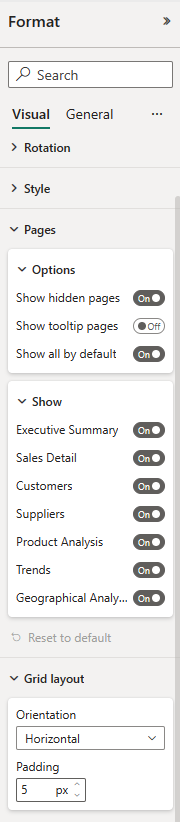
Here’s a screenshot of the formatting options for the grid layout and the pages.
If there was an option to “fit name to width” then I wouldn’t be writing this blog post, but unfortunately that is a massive opportunity missed with this update.
I’m sure it’s not as simple as that but something to allow us to adjust individual buttons within the full visual would have made this an almost perfect update.
One extremely important point that I’d like to make on all of this, is the fact that the navigation does still work, the visual with all of my formatting changes will do the job intended.
The problem lies around the aesthetic of the finished visual with all of the inconsistent gaps in between that makes it look messy and unprofessional.
I could remedy this by adding a button fill, or maybe a button border to each, then the consistent shape of the buttons would force them to look like an even layout, but that is not the point of this post.
The screenshot below illustrates the gap differences if each page name is of a different length:
CONCLUSION
As I mentioned at the start of the post, the updates are very welcome and I know that Miguel Myers and the Power BI team are working very hard to bring the visuals and the whole Power BI design options into the 21st century.
So maybe this is on the roadmap to be “fixed” already, if so, then I would be able to finally use this time saving visual, but for now, it’s a manual process for me still, with individual buttons and FULL control of where I place them, and also controlling the gaps between each of them.
Our takeaway from this, is to always think about how your published report or dashboard is perceived from both a UI and a UX perspective.