INTRODUCTION
When designing your report layout, you should think very carefully about how it’s going to be used. The visuals you will be using, where you are going to place them, and which other objects you add all make a huge difference to how report consumers view, and interact with your design.
For example, how is the navigation going to executed, what can the audience interact with, will there be separate pages for each business process?
User Experience (UX) is paramount when thinking about how the report viewers will interact with the data and the page components.

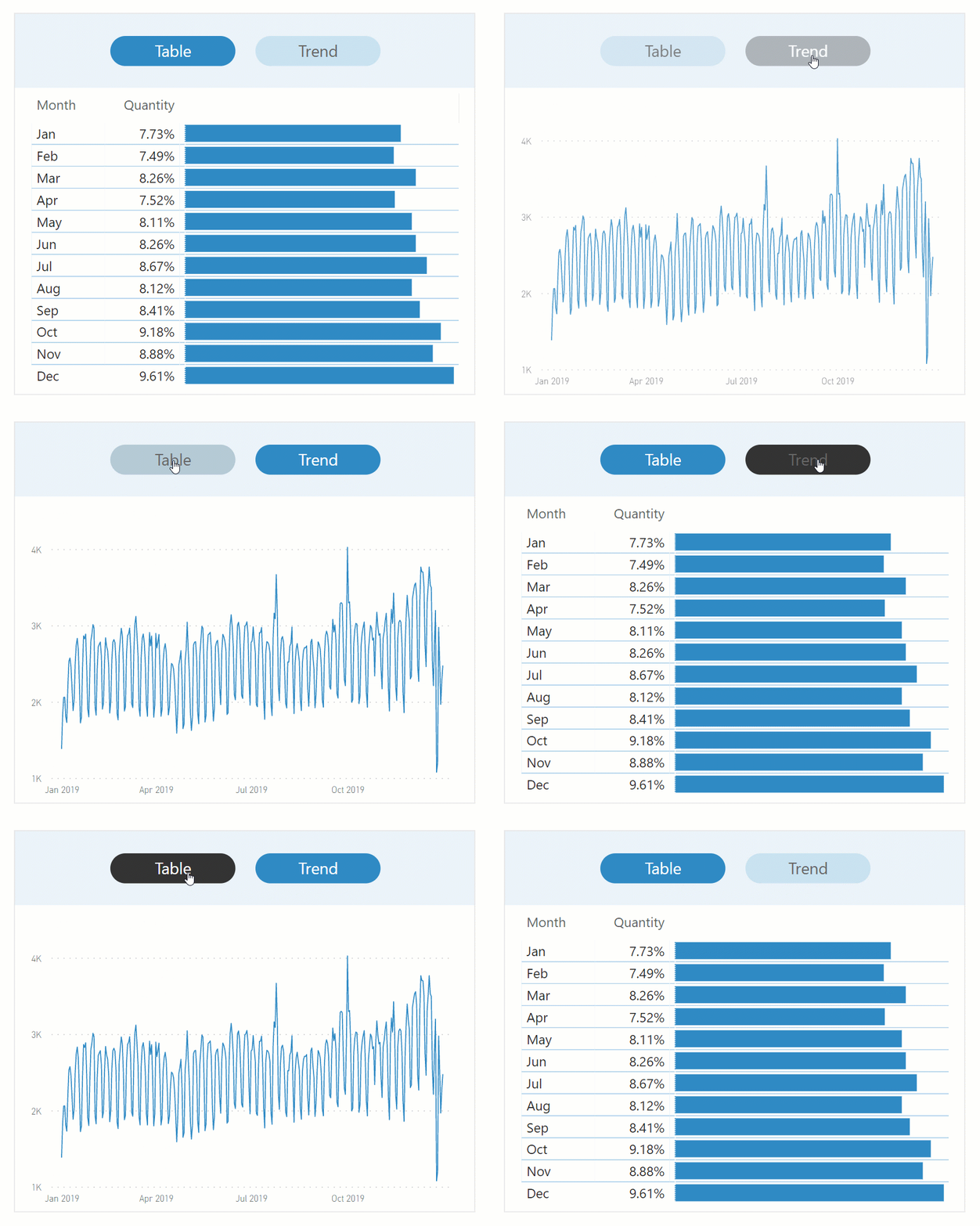
Something that I use a lot of are ‘call to action’ buttons. As the example above shows, we can see that there are 2 pill shaped buttons that can be clicked to change the view of the data, to either a tabular format, or a chart showing the trend over time. This gives the user more than one way to view the same data.
WHAT IS A CALL TO ACTION?
A call to action, a button in this instance, is an object that encourages the audience to do something.
Luckily, these buttons are very familiar to users as they are widely utilised in web pages and mobile apps.
So, for that reason, guidance is not needed as the user will instantly know that this button is ‘clickable’, and will take them somewhere.
HOW DO I CREATE ONE?
Luckily, we have plenty of object design options now in Power BI Desktop.
The way this call to action button is created is by adding a shape from the ribbon, and selecting the Pill option.
From the Formatting Pane, add text and adjust the font size to fit.
Next, a very important part of the design is to configure the ‘default’, ‘On hover’, and ‘On press’ states of the shape to simulate the call to action button interaction when someone hovers over it or clicks on it.
The best way to do this is to decide on contrasting colours of both the fill, and the text. See the gif at the top of the page to get some idea of how it should look at the varying states of interaction.

When you’re happy with the way it looks and operates, you next need to apply an ‘Action’ to your shape to jump to another part of the report.
This is usually done by pointing your action button to a pre-prepared bookmark.
Creating bookmarks is beyond the scope of this blog post, but you can find out how to do this by viewing some of my other posts.
CONCLUSION
So you now have a beautifully designed call to action button, which is fully interactive with other report elements.
I’m sure you’ll agree that it not only gives your report consumers more options in terms of data exploration, but it also looks great and very professional which is essential for user engagement and UX design.